HTML/CSS: Images
The img Element
<img src='logo.png' />
<img src='tiger.jpg' alt='This is a picture of a tiger.' />

Styling Images with Box Properties
Box properties are styles that can be assigned to any block level element. Box properties include margins, padding, borders, sizing and floating. This lesson focuses on using these properties on images, but they can also be used on any block level elements (e.g. div, h1, ...).Sizing with Width and Height
There are a number of ways in which we can style images. The most common is to alter the width and height. The CSS width and height attributes can be set to pixels (px), which is the most common, or percents (%). If we want to alter the size of an image and maintain its original proportions, web designers must either use only one of the settings, or do the math to make the settings hold the same proportion. For example, if we have an image that is 734px by 634px originally and we want to shrink the image to be 100x86, any of the following options will work:...
<style>
#img1{width:100px}
#img2{height:86px}
#img3{width:100px; height:86px}
</style>
...
<img src='logo.png' id='img1'' />
<img src='logo.png' id='img2' />
<img src='logo.png' id='img3' />
In lines 8 and 9, the image is resized proportionally because we are only setting one size. So, by setting the width to 100px, the browser automatically alters the height to the same ratio. In line 3, we overtly set each of the measures to the correct size. We could, if desired, use the third option to distort the image by setting either the width or the height to a value that is not proportional to the other.
Borders
Additionally, designers often choose to add a border around an image (or any block level element). The CSS border property takes three pieces of information, each separated by a space: size(px) style color. The size of the border can be anything from 0px (none) to any width. The style options include solid, double, dotted, dashed, inset, outset, groove, and ridge. Finally, the color for a border can be any reserved color OR hex value.
Floating
Finally, images can be styled to have text wrap around them. Typically, in HTML, if an image is placed on a page, the text is aligned with the middle of the image: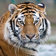 This is text with an image. See how the text aligns with the middle of the image and leaves blank space both below above?
We can cause the text to 'wrap' around the image and fill the space using the CSS float property. The float property can be set to either left or right, identifying the placement of the image.
By setting the style of the image to float:left, we have created a situation in which the text will now wrap around the image, starting at the top and filling all of the space on the page.
<style>
    #img5{float:left}
</style>
...
<img src='tiger.jpg' />
If we set the float value to right, the image would be on the right side of the page and the text would be on the left.It is important to note that float can be applied to many elements including divs. We sometimes want to create an element that ignores the float. To do this, we use clear:both on an element that stops the floating. The code block above used the clear:both style to avoid floating next to the tiger image.
Background Images
Often times, designers would like the background of their page to have a little more style than a simple color. This can be accomplished with using images in the background. This allows text to be written over the images. Background images can be set on any individual element, such as a div, or as the background of the entire page (applied to the body). Background images cannot be sized, but can be set to repeat (horizontally, vertically or both) to fill the area. It is important to note that background images should be in the background - they should not take attention from the important content on the page.While not the only way, this is the easiest way to get text on top of images using only HTML and CSS.
 The CSS background property takes two pieces of information, separated by a space. The first is the address of the image, written in quotes in a url function. The second is the repeat pattern: repeat-x, repeat-y, repeat, or none. In the example below, we will be using the image at right to form the background.
Background Images
<style>
    .divWithBg{
        background:url("pattern.png") no-repeat; width:200px; height:100px
    }
</style>
...
<div class='divWithBg'></div>